Pareto Chart Examples: A Comprehensive Guide for Manufacturing Optimization


.webp)
published
May 4, 2026
Key Takeaways
Pareto charts help teams focus on the “vital few” causes that drive most problems.
Pareto charts are a practical, powerful, step‑by‑step tool for data‑driven prioritization.
Pareto charts are excellent at showing what to address first, but they have real limitations that must be considered
What Is a Pareto Chart?
A Pareto chart is a specialized bar graph that ranks the causes of a problem from most to least frequent, overlaid with a line that shows the relative importance of each factor contributing to an outcome.
Also known as a Pareto diagram or Pareto graph, the concept of a Pareto chart is based on the Pareto principle described by 19th century Italian economist Vilfredo Pareto. Also called the 80/20 rule, it hypothesizes that roughly 80% of effects stem from 20% of causes.
While real-world data rarely splits exactly 80/20, the principle is sound: A small number of factors often cause a high proportion of issues.
By clearly visualizing these imbalances, Pareto charts help teams identify the “vital few” issues contributing to poor OEE that deserve immediate attention.
{{callout1}}
What Are the Key Components of a Pareto Chart?
A Pareto chart is more than just a bar graph; it’s a powerful tool for visualizing and prioritizing improvement opportunities. The key components of a Pareto chart are:
- Bar chart: The foundation of a Pareto chart. Each vertical bar represents a specific category or cause of a problem, with the height of the bar corresponding to its frequency or impact.
- Line graph: A line graph overlays the bar chart to show the cumulative percentage of occurrences. The cumulative percentage measures the total percentage of occurrences accounted for by each successive category.
- Categories and frequencies: Categories are distinct causes of a problem, and the frequencies are the number of times each one happens.
How to Create a Pareto Chart (Step-by-Step)
1. Get Prepared
Clearly define the issue you want to analyze. This could be anything from production downtime and quality defects to safety incidents or customer complaints.
2. Collect and Categorize Your Data
Gather data on the frequency of different factors that contribute to the problem. Data sources might include:
- Machine sensors: Machine performance, downtime events, and error codes.
- Frontline worker input: Issues, observations, and potential causes.
- Production logs: Output, defects, and other relevant metrics.
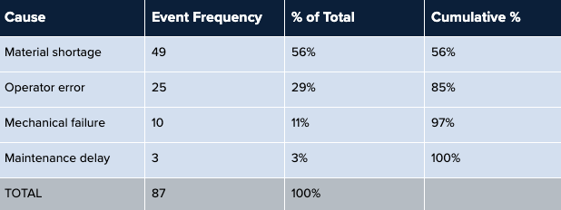
Next, group this data into relevant categories. For example, if you're analyzing machine downtime, categories might include “mechanical failure,” “operator error,” “material shortage,” and “maintenance delay.”
3. Organize Your Data
Count the frequency or impact of each category or cause, then sort the categories in descending order from the most frequent cause to the least.
Then calculate the relative impact of each category using the formula:
Percent of Total = (Incident Frequency / Total Number of Incidents) x 100
Then calculate the cumulative percent of all incidents:
Cumulative Percent: Each % of Total + Previous %s of Total
This shows the total percentage of occurrences accounted for by each category and all preceding categories.
You should end up with a table something like this:
4. Build the Pareto Chart
Plot the categories in descending order on the horizontal axis and their frequencies on the vertical axis. Draw bars for each category and a line graph to represent the cumulative percentage.
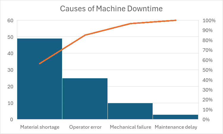
Alt text: Pareto chart example showing causes of machine downtime, with material shortage (56%) as the leading cause.
How to Read a Pareto Chart
Creating a Pareto chart is just the first step. The real value lies in extracting actionable insights to drive improvement. This could mean fixing a specific manufacturing issue or doing root cause analysis.
In the example above, material shortages cause 56% of machine downtime, and operator error causes an additional 29%, for a total of 85%. Therefore, giving immediate attention to fixing material shortage and operator error problems would solve most machine downtime problems. Conversely, fixing mechanical failure and maintenance delay issues would have little effect on the overall problem.
{{callout2}}
What Is a Pareto Chart Used For?
Pareto charts are versatile tools that can be applied to a wide range of manufacturing scenarios to drive improvements in efficiency, quality, and productivity by:
- Pinpointing the root causes of production bottlenecks, quality issues, and downtime events.
- Prioritizing improvement efforts based on data-driven insights.
- Tracking the effectiveness of solutions and measuring their impact on key performance indicators.
- Empowering frontline workers with the information they need to make informed decisions and take proactive action.
Here are some practical examples of how Pareto charts can be used in conjunction with connected worker platforms:
Manufacturing Quality and Defects
With Pareto charts, manufacturers can quickly identify the most frequent types of defects or the production steps that contribute most significantly to quality issues. This allows quality control teams to focus on addressing those issues, implementing corrective actions, and improving overall product quality.
Production Errors
By tracking data on errors, deviations, and rework, manufacturers can pinpoint steps that are most prone to errors. This information can then be used to implement error-proofing measures, such as visual aids, checklists, or automated checks, to improve process consistency. Later, Pareto charts can be used to track the effectiveness of those measures.
Downtime Analysis
Machine breakdowns, material shortages, and changeovers between different product runs are significant causes of downtime, but fixing each requires very different approaches. Pareto charts can identify the root causes of downtime, pinpointing process improvements that will make the most impact.
Analyzing Customer Complaints
Customer satisfaction is a key factor in business retention and growth. By uncovering which issues are responsible for the majority of customer complaints, manufacturers can prioritize solving the most impactful problems first.
Advantages and Limitations of Pareto Charts
Pareto charts are a powerful tool, but they can't solve every problem. They are very effective with categorical, countable data, but not appropriate for complex, multifactored issues.
Pros of Pareto Charts
- Rapid identification of key issues: Pareto charts excel at quickly highlighting the “vital few” factors that contribute most significantly to a problem. This allows teams to prioritize their efforts and focus on the areas with the greatest potential for improvement.
- Data-driven decision making: Instead of relying on gut feelings or assumptions, Pareto charts enable teams to base their actions on objective evidence, leading to more effective solutions.
- Enhanced communication and collaboration: Pareto charts make it easy to share insights and align teams around common goals. They provide a shared understanding of the challenges and opportunities, fostering collaboration and driving collective problem-solving.
- Continuous improvement: By tracking the impact of improvement initiatives over time, Pareto charts enable a culture of continuous improvement. They provide a visual record of progress, motivating teams to sustain their efforts and strive for ongoing optimization.
- Integration with manufacturing software: Pareto charts leverage real-time data and automated analysis from manufacturing platforms to provide accurate and up-to-date insights. This streamlines the process of creating and interpreting Pareto charts, making them readily accessible to frontline workers and managers.
Cons of Pareto Charts
- Oversimplification: While the 80/20 rule is a useful guideline, it’s not always a perfect representation of reality. Some situations may involve more complex interactions between factors, requiring additional analysis beyond the Pareto chart.
- Focus on frequency, not severity: Pareto charts primarily focus on the frequency of occurrences, not necessarily their severity. This means that a less frequent issue with a high impact might be overlooked if not carefully considered.
- Data dependency: The accuracy and reliability of a Pareto chart depend heavily on the quality of the underlying data. Inaccurate or incomplete data can lead to misleading conclusions and misguided actions.
- Limited scope: Pareto charts are most effective at analyzing single dimensions of a problem. For more complex issues with multiple interconnected factors, you may need more comprehensive tools, such as a fishbone analysis.
The Bottom Line
Pareto charts are invaluable tools for identifying and addressing the “vital few” challenges that can disrupt optimal workflows. By solving those problems first, manufacturers can optimize their operations, enhance productivity, and achieve sustainable growth. Book a Demo with Redzone today to see how real-time data from connected workforce solutions can feed your Pareto charts, elevate your operations, and drive remarkable results.
Frequently Asked Questions
What is the 80/20 rule in a Pareto chart?
The 80/20 rule, or the Pareto principle, says that a small proportion of factors cause the majority of a problem.
How does a Pareto chart work?
A Pareto chart uses real-world data to visualize the factors with the greatest influence on manufacturing problems. This makes it easier to identify the most significant causes and prioritize them for remediation.
Is a Pareto chart the same as a bar chart?
No, a Pareto chart is a specialized type of bar chart that overlays the bar with a line showing how much each factor contributes to the overall issue.
What software should you use to create a Pareto chart?
You can use the graphing tools in a spreadsheet application like Excel or Google Sheets or the tools built into your manufacturing software to create a Pareto chart.
When should you use a Pareto chart?
Use a Pareto chart when you have categorical, countable data to analyze. Use failure modes and effects analysis (FMEA), fishbone diagrams, or other methods when facing a complex, multifactorial issue. You can also use a Pareto chart in combination with those other tools for root cause analysis.