6 Manufacturing Dashboards for Visualizing Production


.webp)
published
July 31, 2026
Key Takeaways
A manufacturing dashboard turns live shop-floor data into a display teams can read at a glance and act on during the shift, not in next week’s report.
Unplanned downtime costs the typical industrial business up to $500,000 per hour. A dashboard’s job is to shrink the gap between a problem starting and someone seeing it.
Most plants need 6 dashboards: plant overview, OEE, daily production, downtime and maintenance, quality, and team performance.
Real-time dashboards support decisions on the floor; historical dashboards support improvement work in the review meeting. The value comes from connecting the two.
Design each screen for one role and the few decisions that person makes. If a number wouldn’t change what someone does today, it doesn’t belong on the dashboard.
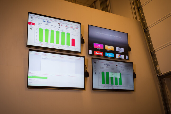
Modern production lines generate more data than anyone can read in raw form: machine states, counts, rejects, temperatures, changeover times. A manufacturing dashboard puts that production data on one live screen, so the people running the plant can spot a problem while it still costs minutes instead of hours.
Unplanned downtime runs between $10,000 and $500,000 per hour for the typical industrial business, according to ABB, so those minutes carry a hefty price tag. This guide covers what a manufacturing dashboard is, why visibility pays, 6 production dashboard examples, and how to design screens your teams will use.
What Is a Manufacturing Dashboard?
A manufacturing dashboard is a real-time visual display that gathers production data (output, downtime, quality, and equipment status) into charts, tables, and indicators a team can absorb in seconds. The data flows in from machines and sensors, from software such as a manufacturing execution system (MES) or an ERP, and from operators logging events at the line.
The dashboard replaces the whiteboard and the end-of-week spreadsheet. Whereas a report tells you what happened after the fact, a dashboard shows what’s happening right now. This is why manufacturers treat it as core infrastructure rather than an IT nicety.
In Deloitte’s 2025 Smart Manufacturing and Operations Survey, 92% of manufacturers said they believe smart manufacturing will be the main driver of competitiveness through 2028. Dashboards are the most visible layer of that stack.
{{callout1}}
Why Manufacturing Dashboards Matter
You can’t fix a problem nobody sees. According to Siemens’ True Cost of Downtime 2024 report, the world’s 500 largest companies lose an estimated $1.4 trillion a year to unplanned downtime, equal to 11% of their combined revenue.
The same report puts the average plant at 25 unplanned downtime incidents and 27 lost production hours a month, and much of that loss hides in slow drips — minor stops, slow cycles, and rework — that never make it into a shift report. Dashboards pull those losses into the open while the fix is still inexpensive.
The payoff shows up in 4 places:
- Faster reaction time: When a line stops or slows, the people who can fix it find out in minutes. The repair starts before the loss compounds.
- Better decisions: Supervisors reallocate people and materials based on current numbers instead of yesterday’s report or a walk past the line.
- Shared accountability: When targets and actuals hang above the shop floor, everyone works from the same facts. Nobody argues about whose spreadsheet is right.
- A foundation for improvement: Logged, time-stamped data feeds root-cause work. A recurring stoppage becomes a 5 Whys exercise with evidence instead of guesswork.
6 Production Dashboard Examples for Visualizing Production
These dashboards cover the questions most plants need answered, including: “How is the site doing?” and “Is this line pacing to plan?” Treat them as a starting set; the right screens for your operation depend on your constraint.
1. Plant Overview Dashboard
The plant overview (some call it "mission control") puts the whole site on one screen: line-by-line status, output against plan, active alerts, and days since the last safety incident. Color-coded tiles let a plant manager scan a dozen lines in seconds, so they can spend the shift where it matters. Leadership walks and shift handoffs run off this screen, and it should link down to the detailed views below rather than try to show everything.
2. OEE Dashboard
An overall equipment effectiveness (OEE) dashboard breaks performance into its 3 pillars (availability, performance, and quality) for each machine or line. OEE rolls the health of an asset into 1 number; the industry treats 85% as world-class, and most plants sit well below it. The dashboard’s value is in the drill-down: When the number dips, the pillar view shows whether you lost time, speed, or good parts, which points improvement work at the right loss.
3. Daily Production Dashboard
The daily production dashboard is the pacing screen: units produced against the hourly target, by line and by shift. Displayed on a large screen at the line, it tells operators and supervisors whether the plan will hold, hours before the end-of-shift count would say so. When actuals fall behind, the team can slide resources, pull forward a changeover, or escalate while the shift can still recover.
4. Downtime and Maintenance Dashboard
This dashboard tracks downtime events by reason code alongside maintenance health: mean time between failures (MTBF), mean time to repair (MTTR), and the status of scheduled preventive maintenance (PM). Chronic minor stops that never reach a shift report become visible as a ranked list of reasons. Maintenance teams use it to defend equipment reliability and to hold a total productive maintenance program to its schedule instead of running reactively.
5. Quality Dashboard
A quality dashboard shows first-pass yield, scrap, and rework by reason and whether teams complete in-process checks on time. The point is catching drift early: a slow slide in yield on one SKU flags a developing problem days before it becomes scrapped product or a customer complaint. Plants running a quality management system (QMS) feed the same data into audits and corrective actions, so the dashboard doubles as living compliance evidence.
6. Team Performance Dashboard
The team performance dashboard shows pace against standard, skills coverage across stations, and wins worth recognizing. Built well, it isn’t surveillance; it gives frontline teams the same visibility managers get, so they can see where they stand and self-correct without a supervisor stepping in. It also surfaces coaching needs early: An operator running slow on one step usually needs training on that step, not pressure.
Here’s how the 6 compare:
Real-Time vs. Historical Dashboards
The 6 examples above split into 2 modes, and strong operations run both. Real-time dashboards serve the current shift: they refresh in seconds, and their audience is the operator or supervisor who can act now.
Historical dashboards serve the review cadence: OEE trends by week, downtime by month, yield by SKU over a quarter. A Pareto chart of last month’s downtime reasons won’t save today’s shift, but it decides where next month’s improvement effort goes. Use real-time views to catch problems and historical views to keep them from coming back.
{{callout2}}
Manufacturing Data Visualization Best Practices
Manufacturing data visualization fails more often from showing too many metrics than too few. In Deloitte’s 2025 survey, 40% of manufacturers ranked data analytics as a top-2 investment priority; the practices below decide whether that investment changes anything on the floor.
- Design for the role, not the system: An operator needs live status and the next task. A supervisor needs shift metrics and line comparisons. An executive needs trends and cost impact. One screen per role beats one complicated screen for everyone.
- Cap the metric count: Hold each screen to 3-5 KPIs and apply the 5-second rule: A viewer should find their answer in about 5 seconds from across the floor. More numbers means slower reading and weaker signals.
- Make color carry meaning: Green means "on plan," amber means "needs attention," red means "act now" — the same logic an andon system has used for decades. Decorative color trains people to tune it out, so the alert that matters doesn't register.
- Pair every actual with a target: A count without a reference point reads as trivia. A bare “412 units” means nothing; “412 of 450 by 2pm” tells the team exactly where it stands.
- Keep the drill-down one click away: The overview answers “what’s happening”; the detail behind it answers “why.” Burying the why in a separate report breaks the chain between seeing a problem and fixing it.
The Bottom Line
Most plants don’t need more data; the average line already produces more of it than anyone reads. Start smaller than feels ambitious: one screen per role, showing the 3 or 4 numbers that person can change before the shift ends. If a metric wouldn’t change a decision today, it belongs in a monthly report, not on the floor.
See how Redzone Analytics puts live production data in front of the people who can act on it.

Frequently Asked Questions
What are the three types of dashboards?
Dashboards are sorted into 3 types: strategic (long-term goals for executives), operational (live monitoring of day-to-day work), and analytical (historical data for finding trends). Most manufacturing dashboards on the shop floor are operational, with analytical views behind them for improvement work.
What is a productivity dashboard?
A productivity dashboard displays output against targets for a line, shift, or team, usually alongside downtime and labor hours. In manufacturing it typically shows units per hour, schedule attainment, and OEE, so supervisors can see whether the plan will hold before the shift ends.
What is the difference between KPIs and dashboards?
A key performance indicator (KPI) is a single measurement, such as OEE or first-pass yield; a dashboard is the display that gathers related KPIs in one place. KPIs define what you measure, and the dashboard makes those measurements visible, so teams can track them and act on them.
What are the 5 KPIs for manufacturing?
Most plants start with 5 core KPIs: overall equipment effectiveness (OEE), downtime, first-pass yield, throughput, and on-time delivery. The right set depends on your constraints; a plant fighting quality escapes should weigh yield and scrap more heavily than one fighting late shipments.
What is the 5-second rule for dashboards?
The 5-second rule says a viewer should find the answer they came for within about 5 seconds of looking at a dashboard. If they can't, the screen carries too much information or buries the key metric. It's a useful gut check for shop-floor displays read at a distance.